bg-sephora

Sephora 

The goal of Sephora's app redesign is to streamline the shopping experience with personalized recommendations, easy navigation, and timely alerts for sales and product restocks, making the app intuitive and engaging for beauty enthusiasts. Features like personalized, interactive, and relevant beauty content enhance the user experience. Key aspects include real-time notifications for price drops, curated sales, a tailored product feed based on user preferences, curated collections showcasing top-selling items, influencer favorites, and trending products, enhancing product discovery and user engagement. 

16

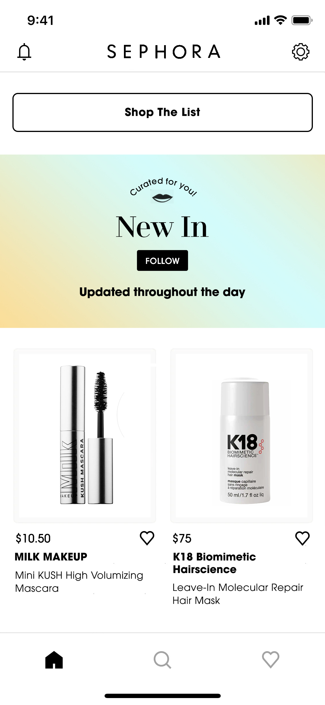
Prioritized engagement and easy navigation. The “New In” section encourages users to explore new products, and gives the option to follow for a personalized offer a personalized experience.
A minimalist layout with bold typography and clear visuals ensures readability, making the shopping experience visually appealing and user-friendly.

23

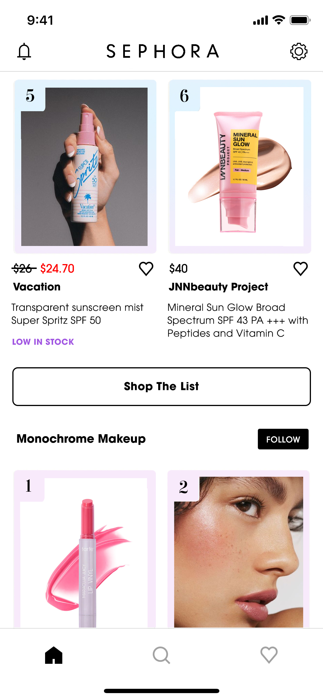
Enhances product discovery with a curated layout of trending items. Numbered labels for trending products add urgency. Users can "Follow” for personalized updates, boosting engagement and loyalty.

Leverage influencer marketing

A curated section that feels personal and tailored, encouraging users to explore Tasha’s selected products. The large, engaging hero image with a playful, friendly vibe creates a sense of authenticity and connection with the influencer. The “Tap to explore” prompt enhances interactivity, inviting users to dive deeper. This design strategy appeals to Sephora’s audience by blending influencer credibility with product discovery in a visually engaging, easy-to-navigate format.

14

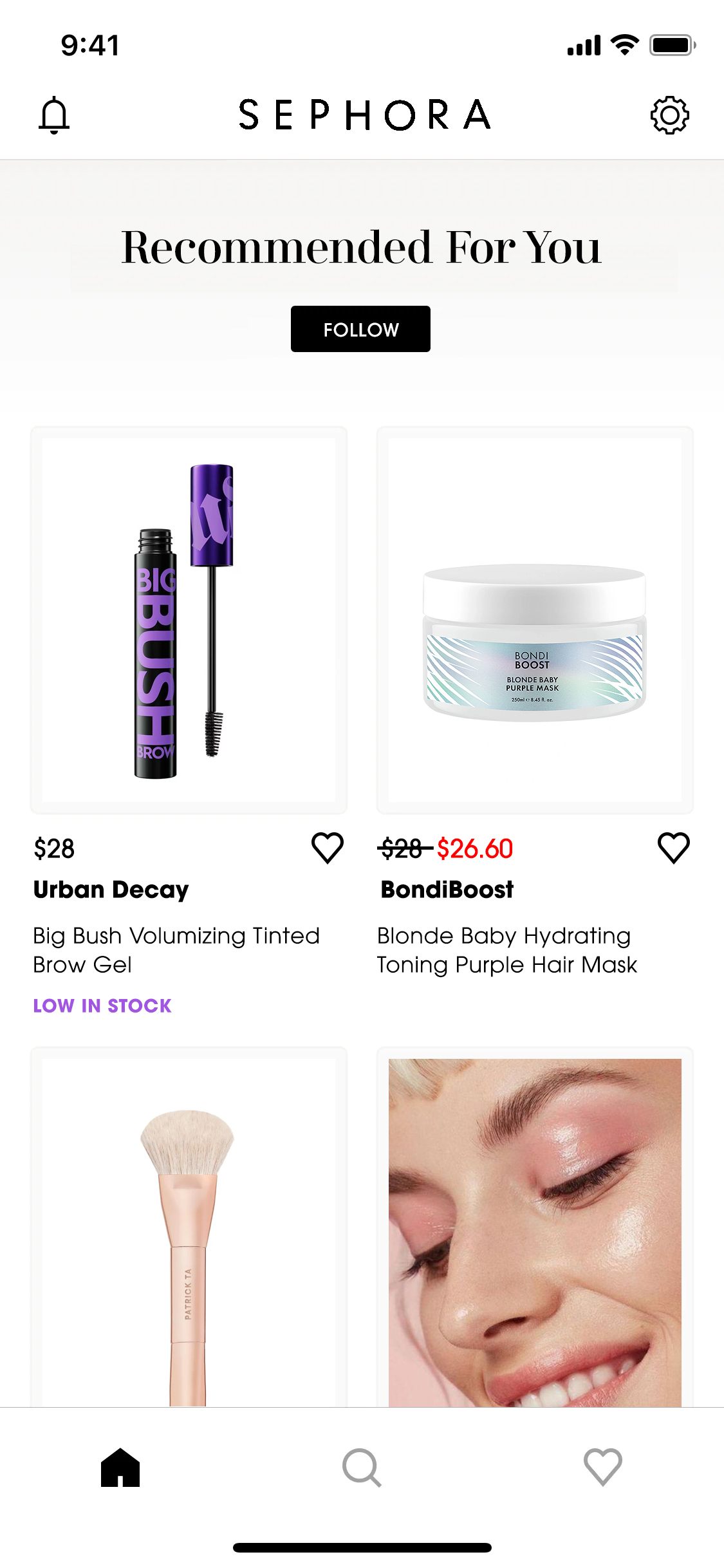
The personalization section offers tailored product suggestions and a clean design highlighting price, brand, and stock for easy comparison. Users follow to stay updated on their favorite brands, encouraging repeat visits.

26

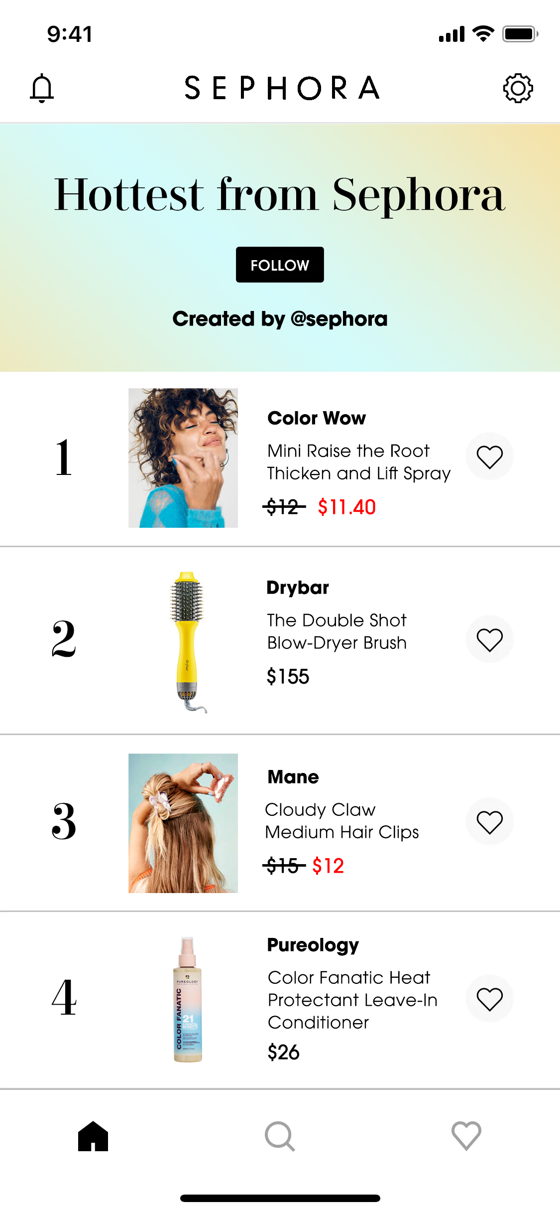
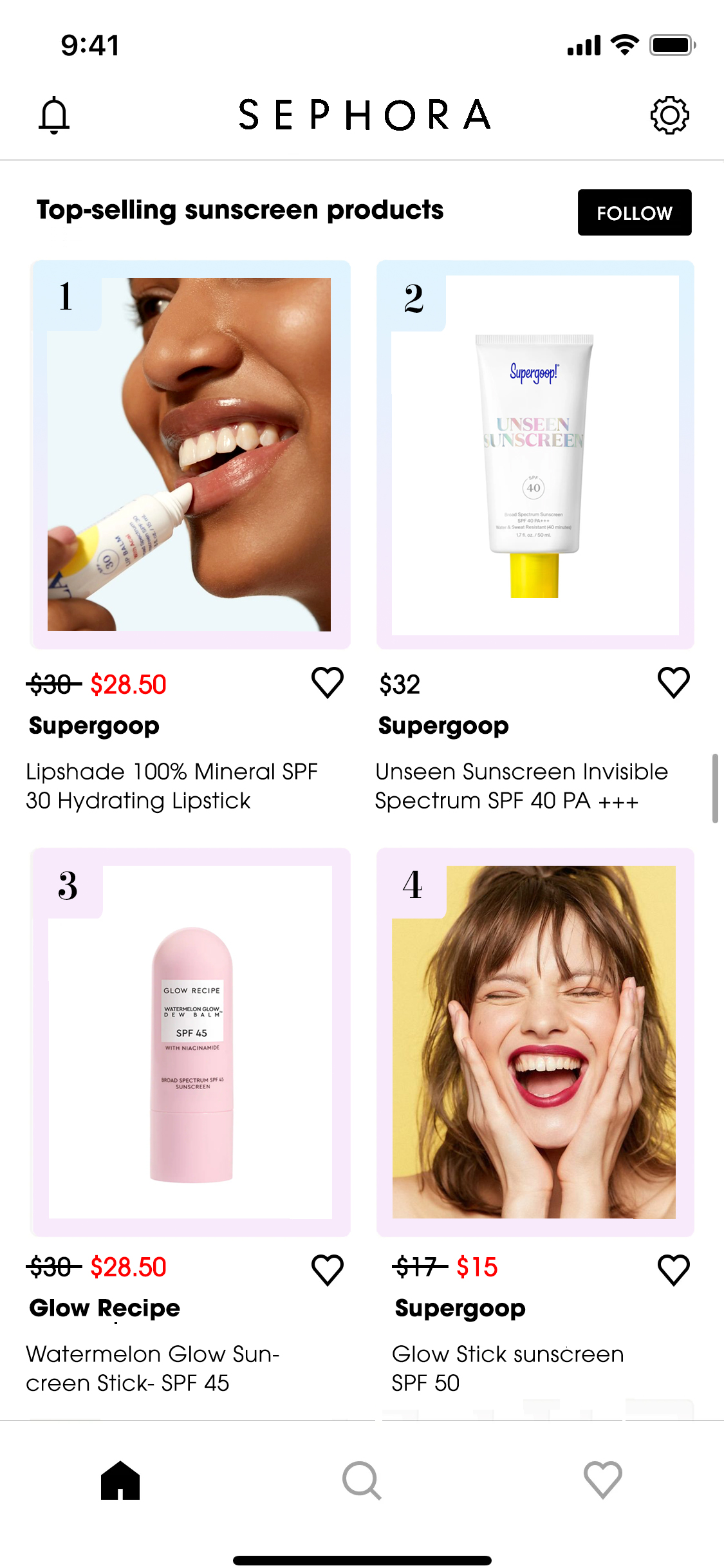
This section offers a curated shopping experience. Follow for updates on trending items. Each product shows key details—name, price, and image—with discounts in red for quick visibility. The layout enables easy browsing, encouraging users to explore popular items and engage with curated content.

21

A curated shopping experience that lets users follow trending updates and product details like name, price, and visuals. Red discounts catch attention, while the clean layout supports easy browsing and engagement.

11

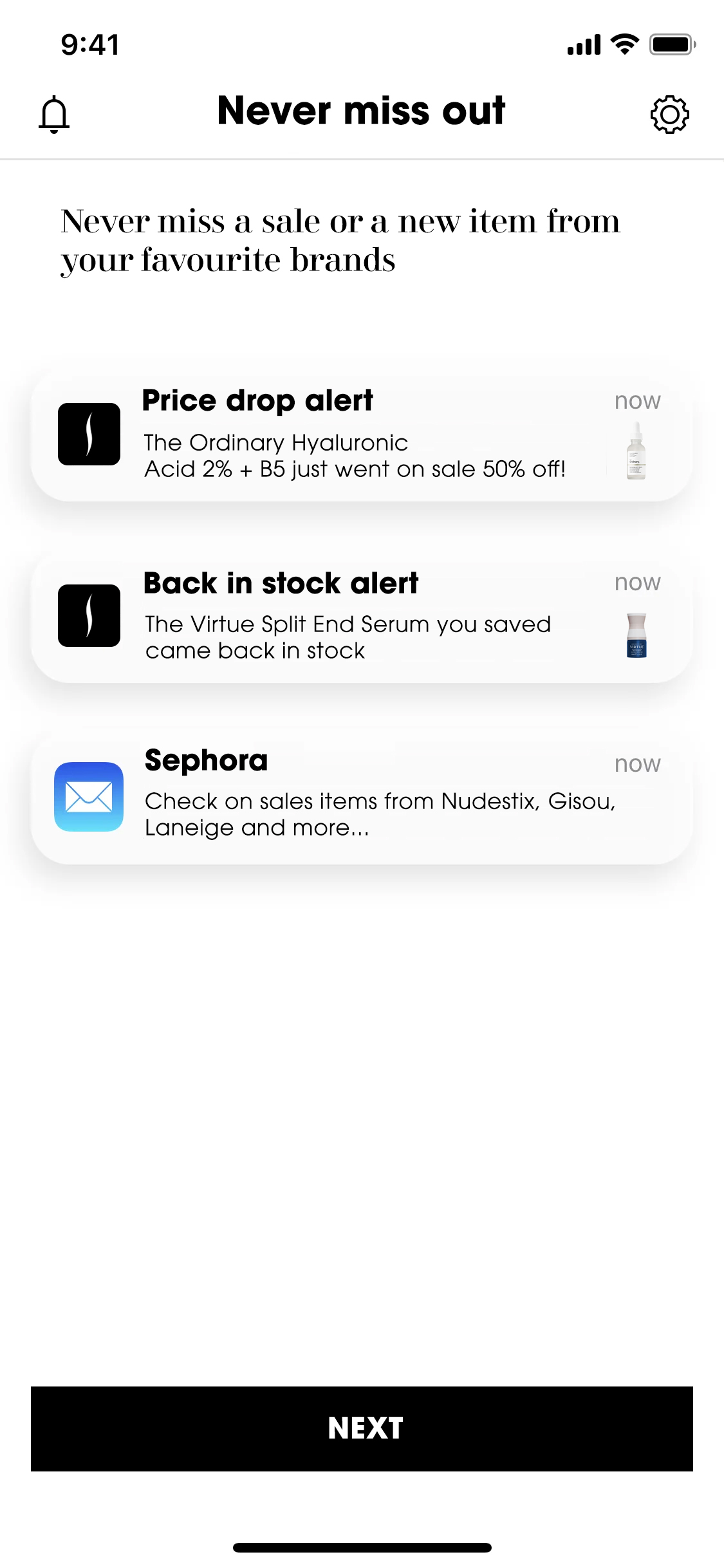
Keeping Sephora members informed with real-time alerts on price drops, restocks, and brand updates to boost engagement. A clean layout and bold text highlight alerts, while product details enable quick assessment.

15

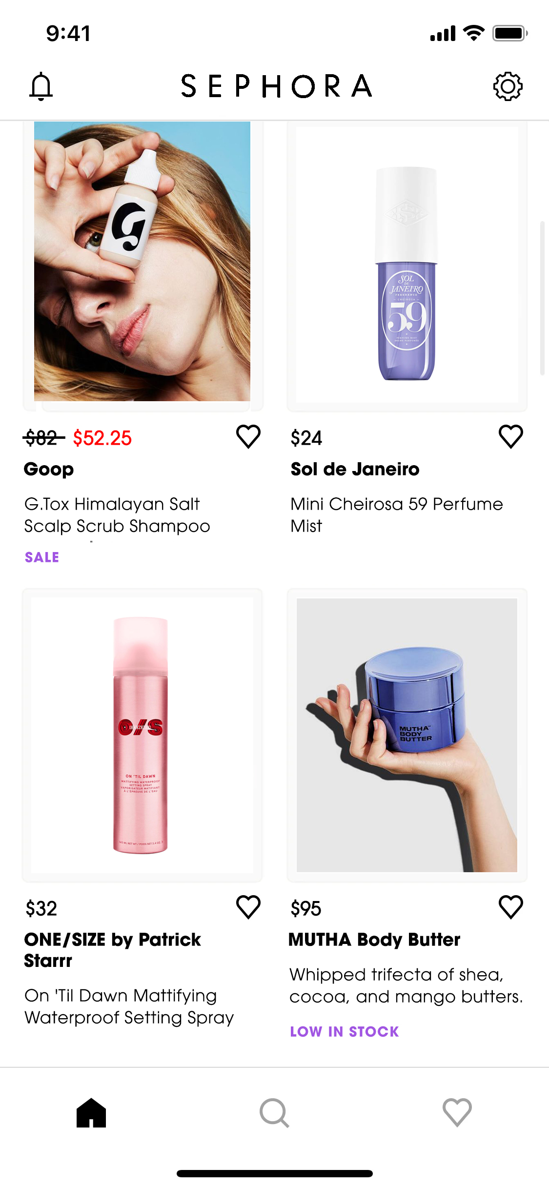
A curated selection of discounted beauty products is presented in a grid layout for easy browsing. Product images, prices, and discounts encourage quick comparisons, while users have the option to save their favorites. The minimalist design with ample white space emphasizes visuals and sale details, enhancing engagement and shopping efficiency for deal-seeking users.

More Projects

Sephora AppApp Design

American Cults NFTsDesign, Motion, NFT

Diesel CampaignDesign, Advertising, Print

Coach Gentlemen's ListDesign, Editorial

Aria ExchangeDesign, Motion, NFT

CoachtopiaDesign, Motion, Branding

CliniqueDesign, Motion,

Coach Insider Membership ProgramDesign, Motion, Branding

Wildfox CoutureDigital, Social

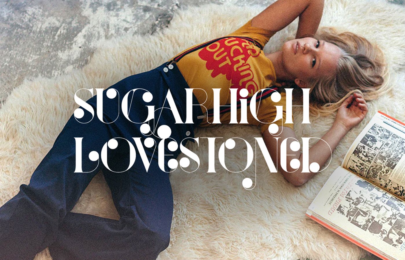
Sugarhigh LovestonedDigital, Social

Bowie X StonedDigital, Social

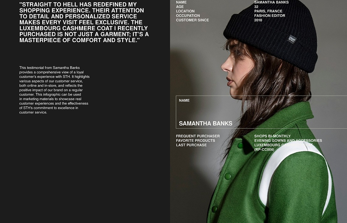
Straight To HellDigital, Social, Visual Brand Identity

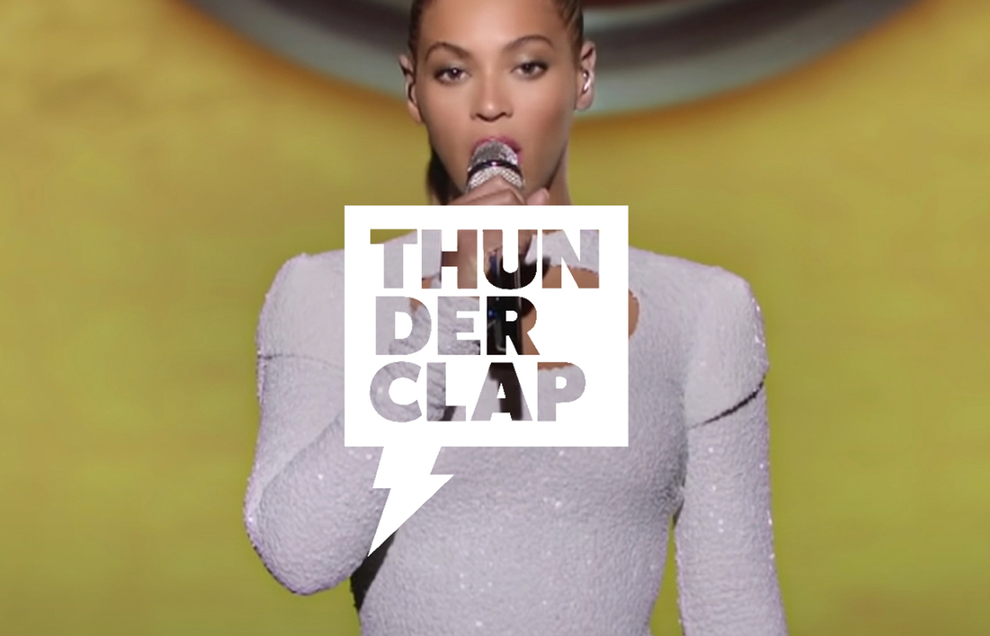
ThunderclapDigital, Social

Catch Restaurant Brand RefeshDigital, Social, Branding, Packaging

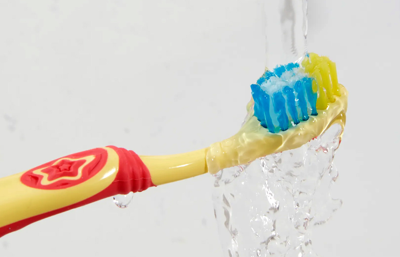
Colgate Hum KidsDigital, Social

PumaDigital, Branding, Moving Image, Experiential, Social, Data Visualization

Coach CreativeDigital, Print, Branding, Moving Image, Experiential, Social, Direct Response

Audi A1Digital, Print, Branding, Experiential, Social, Direct Response, Data Visualization

DeLeón TequilaDigital, Print, Branding, Moving Image, Experiential, Social, Direct Response

The Unicef Tap ProjectDigital, Branding, Experiential, Social, Data Visualization

Chobani Simply 100Digital, Branding, Social

Chobani Food IncubatorDigital, Branding, Social, Direct Response

MakerbotDigital, Branding, Experiential

Coach X PeanutsDigital, Branding, Moving Image, Experiential, Social

Movie PostersDigital, Print, Branding, Social

Mr SpoilsDigital, Print, Branding, Moving Image, Experiential, Social, Direct Response

Coach Journey & CityguidesDigital, Print, Branding

The KooplesDigital, UI, UX, Branding, Design

Boll & BranchDigital

Barton F. GrafDigital, Social

LogosBranding

Google Creative LabDigital, Experiential, Social

Little DonkeyDigital, Print, Branding, Social

@2024 Kathrin Laser | Disclaimer

Translating Ideas and Brands into Digital Experiences.